The sky.
Someone gave me this riddle earlier today, in the sort of coincidence that would make me extremely skeptical if it weren't me that it happened to. Because I'd been working on this post, I was able to answer pretty quickly. Thanks to this post, I was not eaten and instead used the magic ring I found to escape.
So, the sky is black at night, blue in the day, red between the two. Why? This is a classic children's question, and most of us probably know the answer. In increasing order of scientific sophistication, the answers could be:
"Magic."
"Because of light." (my roommate said this when I asked)
"The air scatters blue light more than the other colors, so the sky looks blue."
"Short wavelengths (like blue) are scattered more by the air, so those wavelengths are what we see."
"Light in the air undergoes Rayleigh scattering, which scatters short wavelengths more than long ones."
You might note that I allowed an entire level of scientific sophistication for knowing the name of the scattering process. This is unfair, since knowing a name is worth absolutely nothing. Really, all the additional points are from being able to mentally hyperlink to the information in that Wikipedia article. If you tell me "Rayleigh scattering" and I say "what's that?" and you don't know, you don't actually know anything about it and then I'll get mad at you.
In any case, Rayleigh scattering. It's a process that occurs when light encounters particles that are much smaller than its wavelength. Visible light is on the order of 500 nanometers. A molecule of nitrogen (N2) is a couple of angstroms across, and an angstrom is .1 nanometers. Since nitrogen makes up about three-quarters of the atmosphere, it looks like Rayleigh scattering is just the right process for our purposes. When light encounters these particles it "scatters"--that it, it's reflected in different directions depending on what kind of light it is. The sky is whatever color it is because--even though there's no light coming from directions besides towards the sun--the light scatters back to you.
Here's the problem, or the puzzle at least. This is the formula for Rayleigh scattering:

I want you to ignore everything about this except the λ part. λ means wavelength--the distance between two peaks in the light wave. This is an inverse relationship, so as λ is increased, less light is scattered. Longer-wavelength light is red/infrared/microwave/radio wave. Shorter-wavelength light is blue/violet/ultraviolet/X-ray and so on. But it's not just λ--it's λ^4 power. If λ doubles, the amount of light scattered is reduced by 1/(2^4) = one sixteenth. That's a very strong relationship, and it's why the short wavelengths aren't just scattered a little better than the long ones. They dominate.
If short wavelengths scatter better than long ones, why is the sky blue? That is, shouldn't it be violet, since that scatters even better and is even shorter wavelength? This problem is based on a discussion I had with some of my astronomer friends, which was in turned sparked by this xkcd.
The most prominent theory is that violet light is scattered better than blue light, but that our eyes are not as sensitive to violet as blue, so we don't see all that scattered violet light. (I say "violet" rather than "purple" because I think they're technically different. I am not an artist or color scientist though. "Violet" is also a more fun word than "purple.") We also had a competing theory, which was that the difference is simply that there's a lot more blue light than purple to start with in sunlight, so when it gets scattered--even if it doesn't get scattered as much--we still end up with a blue color overall. Can we answer this question...WITH SCIENCE?
Well, I hope so, since we're not going to get this answer any other way. I did try to meditate on it but never got my brain clear enough to run Mathematica in my head.
Our first step: what sort of light comes out of the sun? The sun pumps out a lot of energy, in all different frequencies (frequency and wavelength are in one-to-one correspondence, so if I have a particular frequency, I also have a particular wavelength, just so we're not confused). You might think this would be a really complicated problem. After all, why does the sun shine? Nuclear fusion and stuff, right? Are we going to have to work out all the characteristic emissions of the nuclear processes in the sun, or what?
Thankfully, no. Physicists have a law that dictates how most objects radiate when they are hot. That is, an ideal system ("black body") with nonzero temperature (i.e., it has energy) will give off photons of different kinds of energy. Obviously the hotter it is the more likely higher-energy (lower wavelength/higher frequency) photons are. The exact science of how we calculate this is a bit too in-depth for me to derive here, but it was a major result in early quantum theory. In fact, it was the first theoretical result that suggested such a thing as a "quantum" (smallest possible piece) of light. (Before this, the math predicted an infinite amount of high-energy light. We call this the "ultraviolet catastrophe" which would be an excellent band name.) The formula is this:

Quick run-down here: h is Planck's constant (Max Planck discovered this formula), λ is still wavelength, c is the speed of light, and k is the Boltzmann constant, which is always used when you need to go from temperature to energy. This is a tremendously versatile law, by the way--plug in human body temperature and you'll find that you emit in the far infrared, hence the use of infrared light for night-vision.
We're going to use this to figure out the spectrum of the sun. How hot is the sun? Wikipedia tells me it is about 5778 K. (Temperature in thermodynamics = always in kelvins. It's also not "degrees kelvin" but that's fine, I make that mistake all the time too.) I plug that into Planck's Law and this is what part of that graph looks like:

The y-axis has units of--deep breath-- watts per meter squared per steradian per hertz. We're not going to worry about that, though, which I'll talk about in a second. What's important is that this is a pretty good match for the actual spectrum of the sun. You'll note that it's at its highest (this is only a part of the function, of course, but the black body radiation only peaks once) at about 500nm, or a little higher. In fact, the "visible spectrum" is roughly 400nm - 700nm. Your eyes are fantastically well adapted to the particular star they evolved around; aliens testing your color sensitivity could probably guess the temperature of the sun. So this is a good match for everyone's favorite star.
Now the question becomes, what about the scattering intensity? Well, I posted the formula for Rayleigh scattering above. Can I just put my numbers through that?
It turns out that that's actually more complicated than we need it. To do that, we'd need to calculate the actual intensity of sunlight falling on Earth--our black body spectrum accounts for the energy coming out of the sun per are on the sun's surface, which is really different--and then we'd have to define other parameters, like the angles involved, our distance from the scattering (...how far are you from the sky?), etc.
But consider that all of these things are a matter of multiplication. That is, I'd multiply by the surface are of the sun. Then divide by the fraction that falls on earth. Then multiply by the molecular polarizability of N2. Then multiply by...etc. What will all of this do to the graph?
The answer is: very little. It'll change the dimensions of the y-axis. What was once "1" might become "2." Or "3." Or "4.232343...", but none of these actually matter. The question we're actually concerned with only needs the shape of the graph to stay the same, and changing the scaling (or the units) of the y-axis will not actually affect that. The peak will still be the peak.
So here's what I did: I took our black-body spectrum, call it B(λ). And I made a new plot, of B(λ)/λ^4. There is some constant in front that we'd have to multiply to get a real, quantitative intensity. But, we don't really want that. We just want to know the shape of the spectrum. Sometimes the most valuable scientific instinct is knowing what not to worry about.

We see here the peak is shifted very far back--Mathematica tells me that it's now at 276.45 nm, well into the ultraviolet. In reality, much of that may be mopped up by the ozone layer, I don't actually know. However, it seems that the visible spectrum will indeed be dominated by the very low wavelengths. That is, it will be more violet than blue. I feel that this lends considerable credence towards the theory that the sky is "actually" violet, in that its spectrum peaks there. If you saw the early-400nm light and only that you would see violet, but your eyes don't respond to that as much, so (hypothesis:) that's why the sky is blue.
But we don't have to stop there. If this is the actual spectrum, shouldn't it correspond to the color of the sky? Can we check that? (Scientific method note: got a theory? Make a prediction, and test it. That's pretty much the whole thing.)
That's a fascinating question. Color vision is exceptionally interesting, and it's important to remember that your eyes are not a spectrometer. You don't see a spectral curve, or the peak color of a spectral curve. The basic way this works is that you have three kinds of light-sensitive retinal cells in your eye, called cones: S, M, and L. Each of these responds to different wavelengths, with peaks in the blue, green, and red respectively. However, importantly, they respond in a curve--red might peak at 575nm, but it responds pretty well to 550nm and even 525nm. This is what the response curves looks like, from Wikipedia:
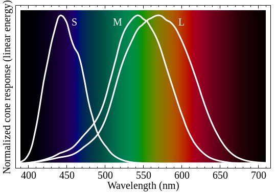
These are not mathematical functions, and I can't work with "pictures on Wikipedia" formulaically. But I'm modeling a phenomenon, so I'm going to pick some mathematical functions and pretend those are the response curves! Science! (Science recipe: make stuff up and if it doesn't work, make up different stuff until it does.) To me, those look like bell curves. Or Gaussian distributions, or normal distributions, or whatever you want to call them. So I made my own curves with the same peaks, similar widths, and I played around with the amplitudes so they'd all have a maximum value of 1.0.

Why, you might ask, would do this, Zach? And I would say that this is the key to converting a spectrum of light into a perceived color. And you might still ask why I would do that but I suspect you wouldn't be reading if you were prone to that sort of feeling. But seriously, this is the key. What I did was multiply the spectrum by the sensitivity curve. I think a diagram will make this most clear:

The black line here is the portion of the scattered spectrum that falls in the visible range, and the green line is the sensitivity curve for green that we calculated earlier. The purple line is formed by multiplying the two together. If there was not much scattering but the cone was highly sensitive, we'd still get a lot of response, and vice versa. I take the area under the purple line and I call that the "green response." If I repeat this with the other two cones, I have a guess at how they will respond to a given spectrum.
Now, the Red-Green-Blue color model expresses all colors a mixture of those three base colors. I calculate the largest value the spectrum reaches on the visible range, and I ask what would happen if I integrated this across the entire curve. This gives me a maximum possible value for the response for each cone. (I need to do the "largest value" thing so I can have a scale for the problem.) Then, I divide the real response by that maximum one, and I have my RGB value for that color. There's a bit of finagling here. RGB is a computer color model, and not necessarily exactly how the biology of the eye actually works. Again, we're throwing science at the wall and seeing what sticks.
Finally, I have one more problem that's worth addressing. Remember how we threw away the intensity scaling at the beginning, because it was too difficult? Well, it's back to bite us now. You see, this tells us the ratio of red to green to blue--but it doesn't tell us anything about their actual values per se. For example, I can't tell the difference between 255,255,255 (white) and 0,0,0 (black). What I'm lacking here is brightness, essentially.
In some sense this is a failure of the method. But it actually can still be useful. What we have here now is a range of colors, instead of just one, because I can aways multiply my base ratio to get a new color with the same ratio. If I have 1,2,3 then I also have 50,100,150, for instance.
Enough talk. I'd like to show you the colors I got for our spectrum. This is a range of five of them, from dark to light.

:)
Looks like the sky to me. You can even see the gradient, which is noticeable during the day. Sky near the sun has more light in general and looks like the lighter blue; sky far from the sun is only scattered and has less light total and so looks like the darker circles.
Can I recap? Can I talk about how awesome this is for a second? What'd we know at the start? We knew how hot the sun was. We knew the dependence (not even the exact factors) on wavelength of Rayleigh scattering. And we knew how our eyes responded to light. And yet, when I wake up, and go outside tomorrow morning, I'll be able to look up and say..."yeah, that makes sense." I find the extrapolation of reality from these sorts of starting variables and logic to be probably the coolest thing in the whole world.
Some caveats here. I was always a believer in the biological explanation for why the sky was blue--that is, I thought it would come down to receptors and not the increased amount of blue light in the starting spectrum. Along the way, you can see that I made many approximations and guesses. (And I don't even show you all the things I tried that just did not work at all.) With this much tweaking, its possibly my expectation/desires influenced the result, which is why it's important that I've told you what I did and why I did it at every step.
Finally, just because I came up with an explanation doesn't mean that it's the right one. Maybe my ozone comment earlier is quite important--maybe in reality there's a totally different scattered spectrum because the ozone absorbs too much short-wavelength light before it is scattered. (You can look this up if you want. Exercise for the reader.) If you have a criticism or an idea of how it could be done, I would absolutely love to hear it. Mostly I'd love to know that someone read it closely enough to critique it, but scientific curiosity is also welcomed and all that.
When I have children and they ask why the sky is blue, I'm going to knock that one out of the park.
As always, the computer file used in computing these figures is available publicly. You will need Mathematica to run it. I was using Mathematica 8, but I know nothing about its backwards compatibility. (Or forwards compatibility? My school doesn't have Mathematica 9 yet.)
http://dl.dropbox.com/u/32594622/solarspectrum.nb
You're punny. How much time did this take you?
ReplyDeleteI dunno. A few hours. I did all the work before I did any writing, and then I just had to write it all up and pretty the graphs up a bit.
DeleteThat was the coolest damn thing.
ReplyDelete